Persuasive website design without pressure tactics
Help visitors make a confident decision with clear information, relevant proof, readable choices and an honest explanation of the next step.
 Robert TicknerWeb designer, Melbourne
On this page
You do not need to push a visitor into an enquiry. You need to help them understand whether your service fits and what will happen if they contact you.
That is the useful job of persuasive design. It makes important information easier to notice and choices easier to understand. The result still depends on the offer, the audience and the business’s response, so no layout can promise a conversion rate by itself.
Make the main decision visible
Decide what the page asks the visitor to do. A service page may ask for a quote request. A shop product page may support a purchase. A Home page may help someone choose the right service first.
The Home page structure guide covers that first route into the business. For a direct enquiry, the service page guide puts the offer and contact requirements together.
Avoid giving every action the same visual weight. A clearly presented main action and a useful alternative can make the page easier to follow than six equally prominent buttons.
Put answers near the point of hesitation
If price affects the decision, explain the price or how it is quoted. If a service needs an assessment, describe that step. If customers worry about suitability, show the relevant scope and limits.
The website copy worksheet helps gather those answers. Design then gives them a readable place on the page. Do not hide a condition in tiny text after a strong promise at the top.
For an illustrative consultation, a button saying “Book a consultation” should sit with accurate information about the format and any fee. Clarity is useful even when it means some visitors decide the service is not right for them.
Use proof that supports this offer
A project photo can show the type of work. A relevant review can describe a genuine experience. A process explanation can reduce uncertainty about what happens next.
The professional presence guide helps choose evidence that represents the actual business. The branding consistency checks help keep the same identity and information across the pages around it.
Avoid borrowing credibility from an unrelated result or showing a stock image as if it is a completed client project. A persuasive page should make the evidence easier to understand, not stronger than the facts allow.
Make the page easy to read and use
Use a clear text hierarchy, readable contrast and enough spacing to distinguish sections. Keep buttons recognisable and forms labelled. A person using a keyboard should also be able to reach the important actions.
The typography guide and colour guide explain the visual choices. The mobile checks help inspect them on a phone rather than assuming the desktop layout proves the task works.
Explain the next step honestly
If the customer is requesting information, say that. If a booking requires payment or confirmation, make those steps clear. Avoid false countdowns, invented scarcity or claims about other customers that you cannot verify.
For campaign pages, check the message against the advertisement. The local landing-page brief connects the offer, page and response process so each part makes the same promise.
Test one useful change at a time
Start with a problem you can observe: a confusing label, missing scope information or a form that asks for details customers cannot supply. Make a deliberate change and record it.
Review enquiry quality as well as volume. Small numbers and changing traffic sources limit what you can conclude. The website audit guide helps separate evidence from an assumption about why performance changed.
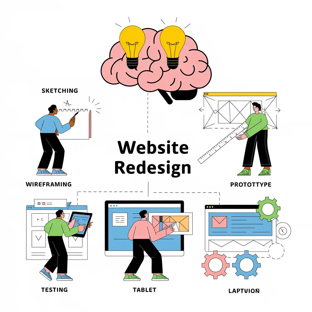
For changes across several pages, the website redesign process helps establish the brief and order of work. Our custom website design service uses that brief to plan the design choices. Begin with a clear offer and an honest customer path; then give the design a job it can actually perform.
Robert Tickner
Founder and web designer, Web Design Studio Melbourne
Robert works directly with small businesses on website design, content structure and local SEO. His approach starts with the business offer and the customer’s next step.
First published .
Prepared with AI assistance. Examples labelled illustrative are not client results.